Crystal Cafe Website Design
Crystal Cafe Website Design
concept project
Role: UX Designer
Date: August 2023 - September 2023
Team: Candace Roberts
Project Overview
Crystal Cafe is a local cafe offering delicious food and refreshing beverages in a relaxing / comfortable environment. They use fresh ingredients in their food and also offer recipe cards of what they use to make their food. Crystal Cafe knows there are people who have allergies to certain ingredients, dietary restrictions, or follow a specific lifestyle. They make sure they provide many option for everyone to enjoy ordering from them.
Project Goal
Design a website for Crystal Cafe that allows users to view nutritional information and ingredients of their menu items without sacrificing taste or pleasure.
User Research
I conducted interviews to better understand the users and their needs with the website I’m designing. The primary user group identified through the research are adults who experience challenges when finding food that meets their lifestyle, whether they have food allergies, diabetic, or want a healthier lifestyle.
This user group confirmed that they have problems finding food choices that meets the needs of themselves or others. While some users have a much simpler eating plan they follow, others seem to follow a stricter plan that eliminate certain food groups that many individuals enjoy daily.
Pain Points
Here are the major pain points I was able to penpoint in my research from the target audience.
Defining a target user & problem statement
Problem Statement
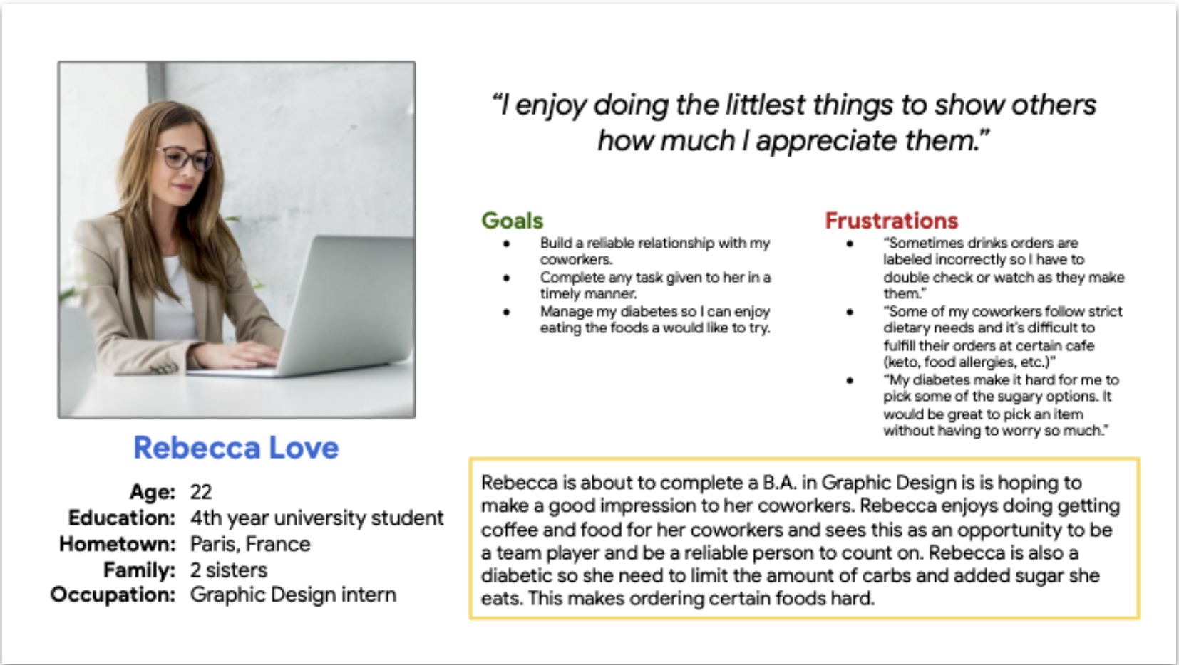
Rebecca Love is a Graphic Design intern that developed diabetes who needs to limited the amount of carbs or added sugars she intake because she wants to be able to manage her diabetes more while also enjoying more food options in the future.
Design Iterations
Sitemap
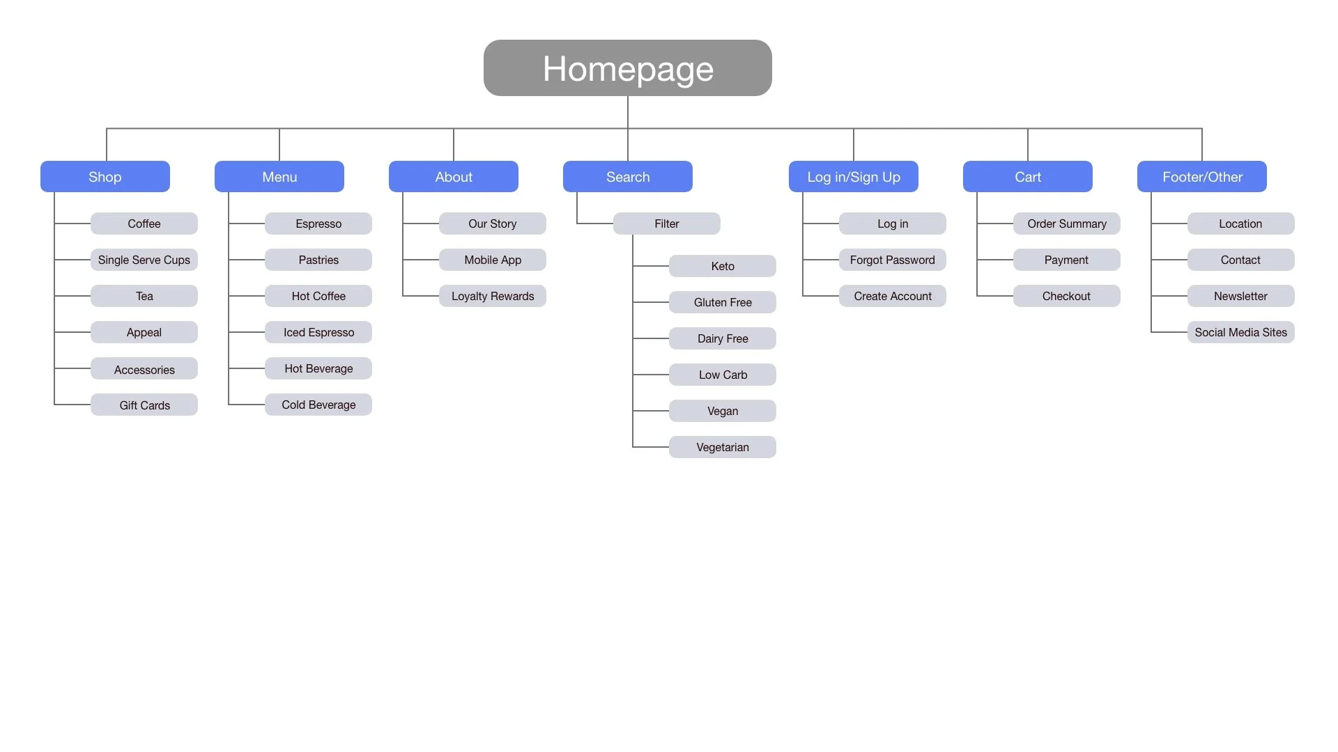
My goal was to indicate how the homepage would operate if it was a real website. I wanted to show what options were available if anyone were to interact with the options.
Paper Wireframes
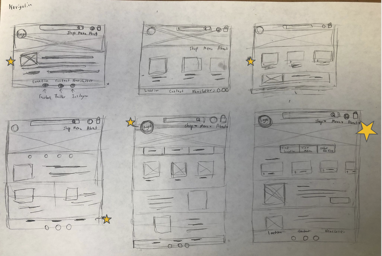
I wanted to take inspiration from other website layout and make the ordering process easy for users to use. I later combined the parts that I liked to make a desirable home page.
Paper wireframe screen size variation(s)
Because users today look at many website on a variety of different devices, I wanted to work on designs for additional screen sizes to make sure the website would be fully responsive.
Digital Wireframes
While designing the digital wireframes I began to redesign how the homepage of the website would improve the user’s experience.
I wanted the users to be able to interact with the homepage and provide different ways for them to begin ordering their items.
Digital Wireframes Screen Size Variations
Desktop
Mobile
Low-Fidelity Prototype
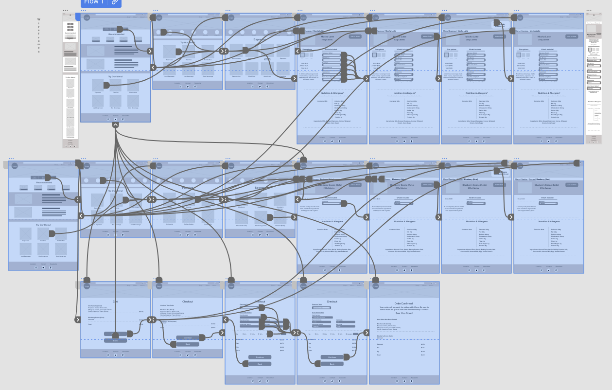
The low-fidelity prototype connected the primary flow of viewing nutrition, customizing, and ordering menu item from a cafe.
Usability Study: Findings
Screen Size
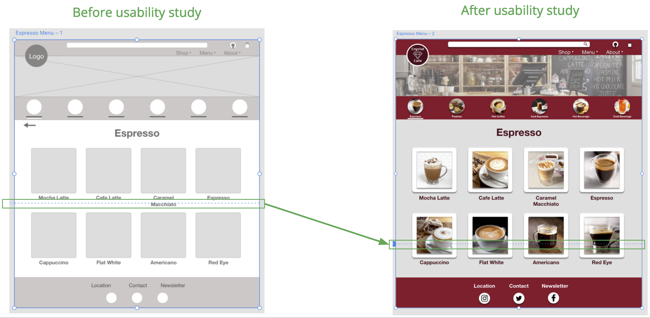
While viewing the website, users will have a hard time viewing the content as a whole because of the screen size.
Back Arrows
Users find that the back arrows were not needed since the product is on a website instead of an app.
Nutrition Info
Users found that the nutritional information for the menu items were too small on the screen.
Mockups
With the help form the usability study I made some improvements to the screen size (blue dotted line). Users explained that the endless scrolling wasted the user’s time where they could use it elsewhere.
Mockups
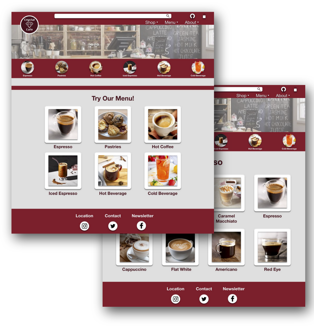
Since users decided that the “back arrow” was unnecessary, I decided to make the menu page more interactable by making the words above the ordering page clickable. I also made sure to increase the size of the nutritional information so users can see them better.
Mockups: Original Screen Size
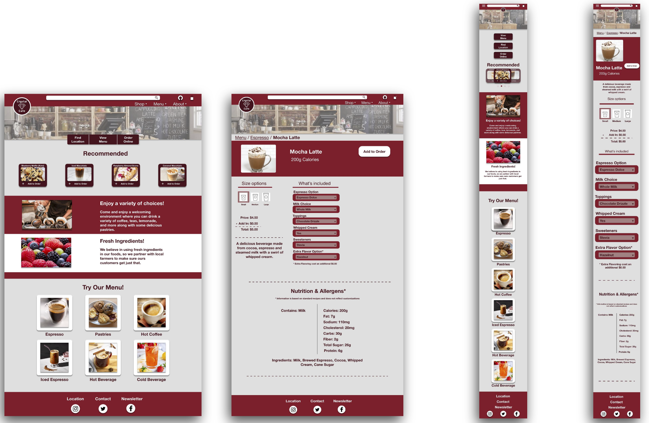
Mockups: Screen Size Variations
Mobile
Desktop
High-Fidelity Prototype
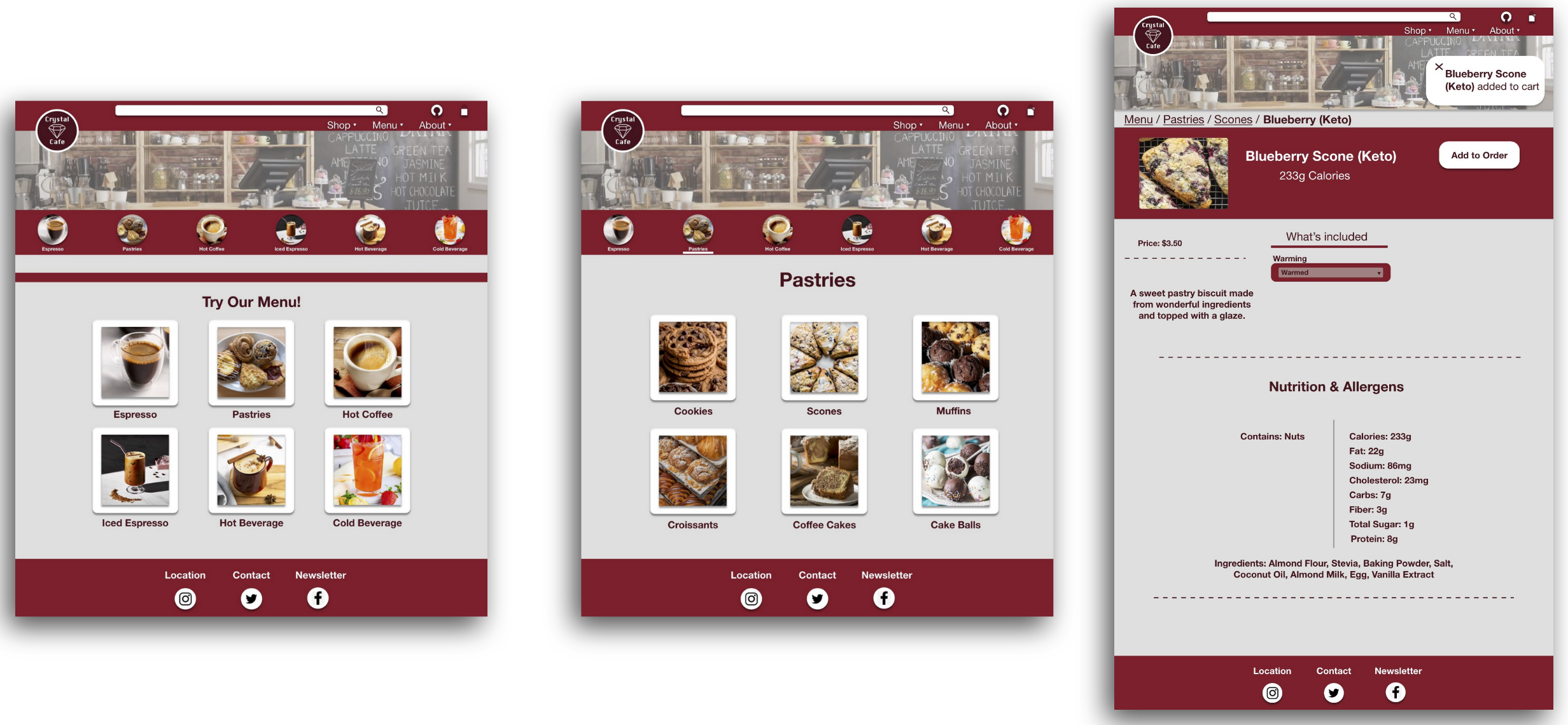
The final high-fidelity prototype follows the same user flow as the lo-fi prototype with updated designs. Some designs were influenced by the usability studies.
Accessibility Considerations
The accessibility considerations I applied to the design:
Made the color scheme dark so users with visual impairment could easily see the design and read the options.
Allow users to search up menu options from the search engine without having to scroll.
Use pictures of the menu items so users know what they are ordering.
Takeaways
Impact:
The website makes users feel like Crystal Cafe knows who their target audiences are by letting them know important information about the food they are ordering. They also like how the design provides a more interactive website and that images are shown for all products.
What I Learned:
I learned that any small step can lead to a beautiful masterpiece, though you will need to put in hours of work to do so. I know that in order to make sure your design is actually ready to submit, you must focus on the users’ needs before anything else.
Next Steps
Here are the next steps I will implement:
Conduct another round of usability studies on the new website design.
Conduct more user research to determine if any additional features are needed for future updates.
